About design
Having inherited the notion that “confectionery is something creative,” this museum has assembled a collection of Picasso’s ceramic art that resonates with that phrase and with the art of confectionery. Therefore, our first concern was about providing a place in which admirers of both Picasso and Yoku Moku’s products would be able to encounter surprises and make discoveries. Furthermore, using our mission and vision statements as a framework, and considering various fields related to art, education, and food through what turned out to be multiple workshops, we produced a design that unified in the physical form of a museum our institutional plans and our ability to carry out our operations.
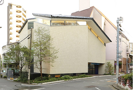
With the idea of being able to welcome visitors as though inviting friends to visit one’s own home, the site for the Yoku Moku Museum was chosen in the Minami-Aoyama residential district. Its architectural design, fitting into the small volume of a two-story residential dwelling, provides, by means of a courtyard and like a mountain house in the middle of the city, a feeling of natural light, fresh air, and vegetation. The building’s materials, evoking both Picasso’s ceramic art and the spirit of confectionery, pay special attention to ceramics. Its roof pays homage to the Côte d’Azur roof–tile designs that were part of Picasso’s ceramics production, while its floors and walls offer an image of kiln-fired, heat-resistant brick.
A feature of Picasso’s ceramics is that, when they are seen in natural light, their colors are very vivid. The second-floor exhibition room’s open space, filled with abundant natural light pouring in from the courtyard, accentuates the power of his ceramic works. By contrast, in the basement-level exhibition space, the light is adjusted according to a scheme that allows for paintings, prints, and other works to be collectively introduced. On one side of the first-floor courtyard, the café, museum shop, and library may be found, and anyone may enter them without having to pass through the exhibition spaces. The café and the exhibition spaces can be adapted and reconfigured to accommodate Art Sessions and lectures, thereby allowing visitors opportunities to encounter surprises and make discoveries.
Signage system
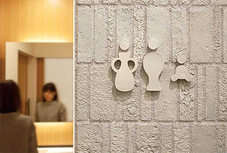
In order to convey a sense of the concept and the idea of the Yoku Moku Museum, the materials of its signage system also make use of ceramics, revealing information units and pictograms, whose colors and shapes serve to unify each space. Like the works of art that Picasso created through an abundantly free-spirited approach, the museum’s spaces have been planned so that they may be enjoyed in their own right.
Graphic design
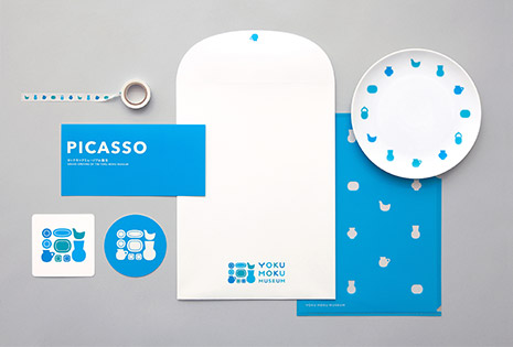
With the warmth and the gentle appearance of ceramics and our Art Sessions and other multifaceted programs in mind, a user-friendly logo design with overall rounded shapes was created to serve as a symbolic motif for the collection’s ceramics; it can be used expansively on posters, exhibition catalogs, museum merchandise and other items. An affinity may be felt between this symbol’s colors and the Yoku Moku corporate-identity scheme, from which the three blues that is uses were derived. It also expresses the spirit of the exuberant ceramics colors that came from Picasso’s production process and from the natural environment.